|
|||||
|
|||||
|
Doing the math Using risk measures in turbulent times Risk is a slippery thing. In good times it is often an afterthought. But it looms large in bad times. Advisors can add real value by carefully measuring and dealing with risk in client portfolios. Problem is, risk is easy to spot with the benefit of hindsight. It is much harder to uncover risk ahead of time. But it's a skill well-worth honing, just ask the client's of advisors who spotted trouble before the Internet bubble burst (these advisors helped save their clients vast sums of money). Modern risk measurement relies on some rather intimidating mathematics. Never fear, however, as I've put away the complicated formulas and I'll do my best to walk you through the basics. To stay grounded in the practical world, I start with the past performance of the S&P 500. In this case, I focus on the market's daily price movements from 1950 through to the end of February 2008. My goal is to provide you with some intuition when using the risk measurements provided by Morningstar. You don't need to know how to do the calculations, Morningstar does that job for you, but it is good to know how to interpret the numbers. Chart Analysis Offers Perspective Let's start with the accompanying graph, which shows two curves. Focus, first, on the curve made up of all the individual data points. These points indicate how often the S&P 500 achieved various percentage returns each day as indicated by the bottom axis. 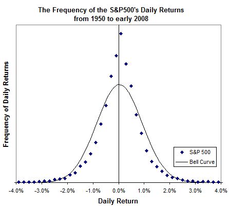
Most often the S&P 500 ekes out a very modest daily gain. Indeed, the very highest data point on the graph represents the 1,985 days on which the S&P 500 gained between 0.0% and 0.2% since 1950. Moving to the right side of the graph, the data point just past the +2% mark represents the 66 times that the S&P 500 was observed to gain between 2.0% and 2.2% since 1950. Most of the time, the index doesn't change much day to day. It usually returns somewhere between -2% and +2% a day. Now, you may have missed it, but that's a crude risk measurement. Based on the historical record, we've observed that daily changes of more than 2% (up or down) are relatively rare. Indeed, there were only 242 days since 1950 when the S&P 500 lost more than 2%. That's an average of about one horrible day every two months. Use of the bell curve To model all of the individual data points, the mathematically inclined turn to the bell curve (or more formally the Gaussian distribution). The bell curve is much favoured by students and mathematicians alike. Students like it because it often boosts their grades. I have fond memories of being 'belled' up from a near pass to an A in a particularly horrible course. Mathematicians like the bell curve because it is easy to work with and, as we shall see, allows us to summarize a whole bunch of data by using only two numbers. Look back to the graph. The solid line represents the bell curve that best fits the index's daily return pattern. You'll notice that it's hardly an exact fit. The bell curve doesn't always fall on top of the data points. Generally speaking, the bell curve isn't quite as spiky as the real observations near the top. It is a little fat around the middle. Near the bottom, the bell curve trails off toward zero too quickly. Despite its faults, the bell curve yields two interesting numbers. The first can be found at its peak, which represents an estimate of the average daily return of the S&P 500. In this case, the top of the bell is just on the positive side of the centre line at 0.03%. Thankfully, even a tiny average daily return of 0.03% can yield significant gains when compounded over the course of a year. Let's now turn to the middle part of the bell curve. It is here where we find something called the standard deviation, which is a measure of the bell curve's girth. It also represents a very common risk measurement. Thanks to my handy calculator, the daily standard deviation of the S&P 500 is about 0.89 percentage points. Here the interpretation gets a little complicated. But the bell curve estimates that the S&P 500's daily return was within one standard deviation of its average return about 68% of the time. That's a mouthful. Put another way, 68% of the time the S&P 500's daily return was between -0.86% and +0.92%. The low end of the range is found by subtracting the standard deviation of 0.89 from the average return of 0.03. The high end of the range is found by adding 0.89 to 0.03. Personally, I have an easier time remembering that 95% of the time the gains fall within two standard deviations of the average. The S&P 500's daily two standard deviations range is between -1.75% and +1.81%. Look back to the graph and you'll remember that the vast majority of the time the S&P 500's daily gains were in the range between -2% and +2%. Using the bell curve we've developed a more precise measurement than we got by simply eyeballing the data. It also lets us condense a great deal of information into only two numbers - the average and standard deviation. Use of annual standard deviation Now let's look at the annual standard deviation of a few funds. The Trimark Fund has a long history and Morningstar's PALTrak reports the fund's annualized standard deviation based on data from the last 3, 5, 10, and 15 years. Most people stick with 3 or 5 year figures. The annual standard deviation based on the last five years worth of data for the Trimark Fund happened to be 11.3. Assume the fund gained an average of 6.3% a year over the same period. Put the two numbers together and 95% of the time the fund's annual gains fell within two standard deviations of its average return. In this case, that's between -16.3% and +28.9% (i.e. between 6.3 minus 2 times 11.3, and 6.3 plus 2 times 11.3). If past is prologue, and we all know that's a mighty big if, then the fund's return next year should fall between -16.3% and +28.9% some 95% of the time. (The standard deviation of a diversified portfolio which includes many funds that cover different asset classes will likely be lower. You can use PALTrak to easily calculate the standard deviation of an entire portfolio.) Old rules of thumb Standard deviations also tend to confirm old rules of thumb. For instance, the relatively safe Scotia Money Market fund has a standard deviation of only 0.23 percentage points. (That's an annualized number based on 3 years of past return data.) Plain bond funds tend to be a little higher. PH&N's Bond fund clocks in at 2.8. Dividend funds are usually among lower risk equity funds. True to form, the Standard Life Canadian Dividend Growth fund has a standard deviation of 9.6. Speciality stock funds tend to be more volatile. For instance, the Sprott Energy Fund has a standard deviation of 28.8. Standard deviations are a reasonable way to measure risk, but you've probably already noticed a few potential problems. Most importantly, it is a profoundly backward-looking method. As we all know, past results may not be predictive of future results. The same goes for risk as measured by standard deviation. More subtly, there might not be much history available for number crunching when it comes to individual funds. Few funds have been around for many decades and most have not been tested during very stressful periods. Even worse, past returns may have been achieved by a different portfolio manager or investment policy. If a new manager is in charge or if the mandate changes, then the fund's risk characteristics may have changed. Yet, I alluded to an even more concerning caveat early on. If you look back at the graph again, in most cases the bell curve is a little wider than the actual returns from the S&P 500. It is thick in the middle. As a result, standard deviation tends to overestimate risk slightly. That's a good thing if you want to err on the conservative side. But the real problem is hidden way down in the tails of the curve. Variations more than two standard deviations away from the average should happen only 5% of the time. It turns out that they are more frequent and can be far larger than expected. Biggest problem is in the extremes You might remember a dark day in October of 1987 when the S&P 500 plunged 20.5%. Yes, that's a 20.5% drop in only one day, which is way off the edge of the chart. Indeed, the bell curve predicts that such an event is a practical impossibility. Standard deviation can do a fairly good job of measuring risk during normal times, but it fails on occasion. Nonetheless, it represents a good starting point and can help you to gauge common risks. But it is also important to go further and marry the figures with good old-fashioned common sense when building portfolios for your clients. First published in the March 2008 edition of Advisor's Edge Report. |
|||||
| |||||
| Disclaimers: Consult with a qualified investment adviser before trading. Past performance is a poor indicator of future performance. The information on this site, and in its related newsletters, is not intended to be, nor does it constitute, financial advice or recommendations. The information on this site is in no way guaranteed for completeness, accuracy or in any other way. More... | |||||